Before guests see the flowers, the tables, or the ceremony setup, they usually see the paper first.
That is why wedding stationery still matters so much. It is not just a card with a date and a location. It is the first real signal of the wedding style. It tells people whether the celebration will feel formal, playful, romantic, modern, colorful, quiet, or full of personality. And in 2026, that first impression is doing more work than ever.
The big shift this year is not that couples are following one single look. It is the opposite. The strongest 2026 wedding stationery trends point in two directions at once. Some couples want cleaner layouts, restrained typography, and soft natural details. Others want bold color, expressive illustration, layered textures, and pieces that feel more like keepsakes than paper goods. What connects both sides is this: couples want stationery that feels personal.
That is the real trend underneath everything else.
For planners, designers, and couples trying to build a wedding that feels coherent from start to finish, this is actually good news. You do not need to copy a trend board word for word. You just need to know which visual ideas are rising, which ones still feel fresh, and how to use them in a way that fits the rest of the event.
Here is what stands out most in wedding invitation and paper design for 2026.
Wedding stationery is acting more like a design system
A few years ago, it was common for couples to treat invitations as a separate task. Pick a pretty suite. Add the details. Send it out. Done.
That is not really how it works now.
In 2026, stationery is behaving more like the opening chapter of the wedding design. The invitation suite is setting the tone for menus, escort cards, ceremony programs, signage, welcome bags, cocktail napkins, and even the way a couple’s monogram or illustration gets repeated through the day. That does not mean everything has to match exactly. But it does mean the paper is part of the overall story.
I think this is one of the best changes in modern wedding design. It makes the wedding feel more intentional. It also helps couples avoid that scattered feeling where the invitation looks one way, the reception feels another way, and the day-of details look like they came from a totally different event.
The strongest suites in 2026 feel connected. They have a visual thread. Sometimes that is typography. Sometimes it is a botanical sketch, a crest, a color family, or a venue illustration. But there is usually one idea running through the whole thing.
Greenery and botanical illustration are still strong, but they look more refined
If you thought greenery was going away, not quite.
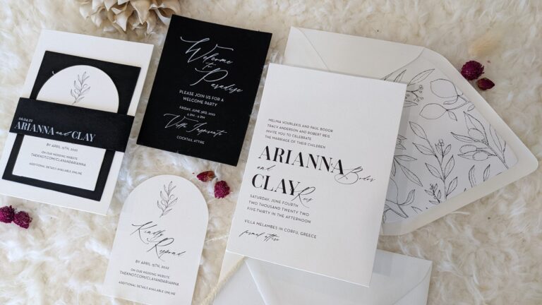
Natural motifs are still very much part of the 2026 picture, but the look is more restrained than the oversized eucalyptus wave that dominated earlier wedding seasons. Instead of stuffing every inch of the card with leafy borders, the stronger version of this trend uses softer structure. Think monochromatic greenery, quieter framing, delicate floral sketches, and botanical illustration that feels intentional instead of busy.
This is part of why botanical artwork keeps hanging around. It works. It feels romantic without being fussy. It fits outdoor ceremonies, garden weddings, estate weddings, vineyard weddings, backyard celebrations, and a lot of destination settings too. It also plays nicely with watercolor, muted pastels, soft neutrals, and textured paper.
And if a couple wants something timeless, this is one of the safest places to start. A clean botanical design does not feel trapped in one season. It feels classic. That matters when you are creating something guests might save for years.
The trick is keeping it edited. One beautiful floral frame or one small illustrated sprig usually goes further than turning the entire card into a greenhouse.
Monograms are back, but they feel cleaner and more useful
There was a stretch where monograms started to feel a little too expected. Too stiff. Too country club. Too much like a leftover from a different era.
That is not what is happening now.
In 2026, monograms are back, but the better ones feel more tailored than traditional. They are showing up with cleaner line work, stronger typography, more negative space, and influences pulled from vintage seals, custom crests, and even wine-label branding. That last part is especially interesting because it gives the monogram a more editorial feel. It can be elegant without feeling old.
This trend works because couples want identity marks they can actually use. A good monogram is not just for the invitation. It can show up on the envelope flap, the menu, cocktail stirrers, favor tags, the welcome sign, the dance floor, or the thank-you cards later. It becomes the shorthand for the event.
For couples planning a more formal celebration, monograms make a lot of sense. But they also work surprisingly well in modern weddings when the mark is simple and the rest of the layout stays clean. A monogram does not have to mean ornate scrollwork and heavy flourishes. In 2026, it can be sharp, minimal, and very current.
Bold color is pushing back against years of safe neutrals
One of the more obvious shifts this year is color.
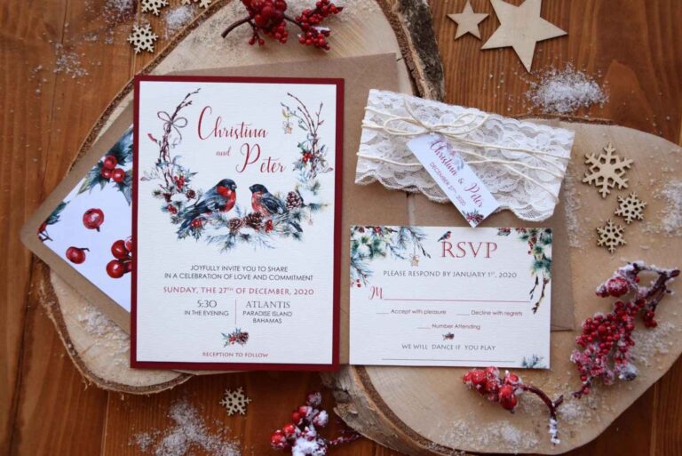
Neutral palettes still exist, of course. They are not disappearing. But a lot of 2026 wedding stationery is moving away from soft beige-on-ivory sameness and leaning into more confident color. Bright pinks, oranges, purples, blue-red pairings, and other playful combinations are showing up in invitation suites, details cards, envelope liners, and day-of paper pieces.
That makes sense. A bold invitation gets attention. It also tells guests right away that the wedding may feel more energetic, more joyful, or more expressive than the standard quiet luxury look.
I like this trend because it opens the door for couples who do not want everything to feel muted in order to feel elegant. You can have both. Rich color and thoughtful design are not opposites. In fact, when the palette is controlled and the typography is strong, bold color can feel more expensive than playing it safe.
This does not mean every couple should suddenly switch to hot pink and tangerine. It means color is back on the table in a serious way. If a couple loves saturated florals, a playful venue, or a high-energy reception, the paper should not look afraid of that.
Illustrated elements make the suite feel more personal
Illustration is one of the biggest reasons wedding stationery feels more alive right now.
Hand-drawn details, sketchbook-style linework, venue art, custom icons, pets, hometown flowers, meaningful foods, coastal motifs, cultural references, and other small visual symbols are giving suites more personality. Some of these illustrations are loose and playful. Others are more refined and romantic. But the underlying point is the same: the stationery should feel like it belongs to this couple and not to a template library.
This is one of my favorite 2026 shifts because it solves a common problem. Couples want personalization, but they do not always want to overshare or stuff the invitation with words. Illustration does that work visually. A custom church sketch, a dog silhouette, a flower tied to family history, or a venue-inspired border can tell guests a lot without saying too much.
It also helps the design feel warmer. A printed piece with one or two hand-touched elements feels more human. And for weddings, that matters. This is not corporate collateral. It is a celebration. Some softness helps.
The key here is restraint. The best illustrated suites are not crowded. They pick a few meaningful elements and let those details carry the emotion.
Texture and dimensional details are doing a lot of the luxury work
This year’s stationery trends are not only visual. They are tactile.
Texture is a big part of what makes wedding paper feel special in 2026. That can show up through lace-inspired patterns, textile references, blind embossing, vellum wraps, layered enclosure cards, or even details cards that feel slightly three-dimensional. The point is to give the suite more than a flat look.
That matters because digital life has trained people to notice physical texture when they get it. A guest can feel the difference between a basic card and a suite that has depth, softness, or some kind of reveal moment.
And that “reveal” idea keeps showing up. Enclosures are having a real moment. Rather than just tossing in loose inserts, couples are using wraps, folds, and layered pieces that make the suite feel more curated. Even small moves can change the experience. A wrap, a textured motif, or embossed illustration can make a suite feel elevated without making it feel overdesigned.
This is also where planners can help couples spend smarter. You do not need every luxury printing method in the book. Usually one tactile element is enough. One textured move does more than five competing embellishments.
The deepest trend is personal meaning
If there is one idea connecting nearly all of the major 2026 wedding stationery trends, it is this: couples want their paper goods to reflect their actual lives.
That can mean personal illustrations. It can mean venue references. It can mean handwriting-inspired text, family symbols, custom monograms, cultural motifs, meaningful colors, or details pulled from a shared memory. It can also mean more intentional wording and design choices that feel emotionally specific instead of overly formal.
This lines up with the broader direction weddings are taking overall. Couples are making more values-driven decisions. They are writing their own vows more often. Many are pulling in cultural or family-specific details in more visible ways. So it makes sense that wedding invitations and other paper goods are following the same pattern.
That is why the best way to use trends in 2026 is not to chase them one by one. It is to ask a simpler question: what should this paper say about the wedding before anyone even arrives?
If the answer is “classic garden celebration,” botanical illustration and refined typography might be enough. If the answer is “bright, layered, and full of energy,” then bold color and illustration might be the better fit. If the answer is “deeply personal and story-driven,” then a custom monogram, venue artwork, and meaningful printed details might do the most work.
How to use 2026 wedding stationery trends without overdoing it
The easiest mistake is trying to fit every trend into one suite.
You do not need botanical illustration, a monogram, bright coral, embossed shells, three inserts, venue art, watercolor lettering, and a custom envelope liner all at once. That usually turns into visual traffic.
A better approach is to choose one lead element, one supporting detail, and one tactile finish.
Maybe the lead element is a custom crest. The supporting detail is a soft botanical border. The tactile finish is blind embossing.
Or maybe the lead element is bold color. The supporting detail is handwritten illustration. The tactile finish is a vellum wrap.
That is enough. More than enough, really.
Good stationery does not win by stacking features. It wins by being clear, thoughtful, and memorable.
Final thoughts
The best 2026 wedding stationery trends are not really about copying what is hot. They are about using design more intentionally.
Greenery is softer now. Botanical illustration is still strong. Monograms feel fresh again. Bold color is back in a serious way. Illustration is getting more personal. Texture is making paper feel special again. And underneath all of it, couples want wedding stationery that feels like theirs.
That is the part worth paying attention to.
Trends come and go. But a wedding suite that feels personal, cohesive, and well considered will always land better than one that only looks current for a minute. If the paper tells the truth about the event, it is probably going to age well too.