“The invitation sets the tone” gets repeated a lot, but in this case it is true. Wedding invitation printing is one of the first real chances you get to show guests what kind of day you are planning. Formal, relaxed, modern, traditional, playful, romantic, all of that starts showing up before anyone sees the flowers or the venue.
And yet, wedding invitation printing can get confusing fast. One minute you are picking fonts. The next minute you are trying to decide between cotton paper, linen texture, foil, letterpress, vellum overlays, and whether your beautiful square invite is going to annoy the post office. I think that is why this part of planning feels fun and frustrating at the same time.
The good news is that most couples do not need to master the entire print world. You just need to make a few smart choices in the right order. Start with the format, then the paper, then the print method, then the mailing details. If you do it in reverse, you can end up paying for something pretty that is hard to read, awkward to mail, or just not right for your wedding style.
If you are also deciding what should stay digital and what belongs on paper, Creative Design Events already has a helpful companion read in Wedding Announcement Templates on Canva and Paperless Post, Plus the Best Place to Print Them. It fits nicely alongside the practical side of this guide.
What Good Wedding Invitation Printing Starts With
Before you think about foil color or deckled edges, figure out what the invitation actually needs to do. That sounds obvious, but a lot of couples skip it. They fall in love with a look first and then try to force all the wording, event details, and RSVP info into a format that does not really fit.
I believe the best place to start is with three questions. What do you want guests to feel when they open the envelope? How much information needs to be included in the suite? And how will the piece be mailed? Those questions usually tell you more than trend photos do.
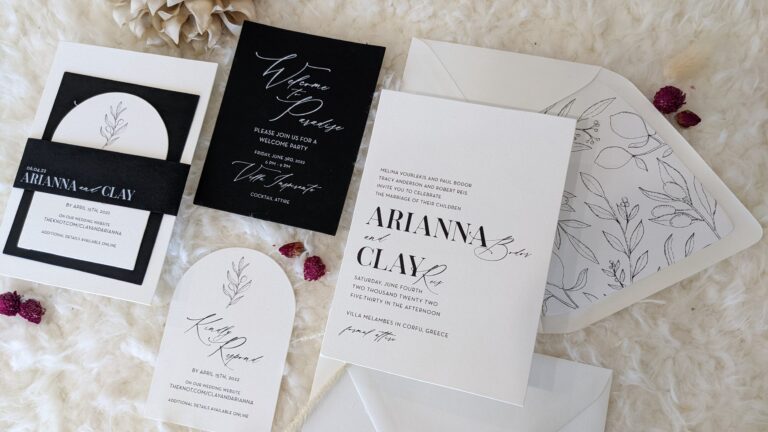
A black-tie ballroom wedding and a backyard garden wedding do not need the same paper feel. A destination weekend with hotel info, shuttle details, and multiple events probably needs more than one card. And a suite with thick layers, ribbon, or wax seals may look amazing in photos but can also change postage and handling. None of that means “don’t do it.” It just means choose with your eyes open.
That is really the heart of wedding invitation printing. It is design plus logistics. The couples who enjoy this process most are usually the ones who accept that both matter.
Choosing Paper Weight and Paper Type
Paper weight is where invitation printing starts to feel real. Guests notice it right away. A flimsy card feels off, even if the design is beautiful. A thicker stock feels more considered and more finished.
For many flat wedding invitations, heavier cover stock is the sweet spot. Formal suites often land around 110 to 130 lb cover, which is roughly in the 300 to 350 gsm range. That gives the main invitation a substantial feel without getting ridiculous. Folded pieces can usually go a little lighter because the fold adds body. If you are building a layered suite, the weight of every piece matters, not just the main card.
Then there is the paper type itself. Smooth matte stock is a safe choice when you want crisp text, clean color, and modern simplicity. Cotton paper has a softer, more refined feel and is especially popular when couples want a tactile, higher-end look. Linen stock adds a subtle woven texture, which can look elegant, but texture can also interfere a bit with large blocks of ink or very fine detail. Vellum is not usually the main workhorse of the suite. It is more often used as an overlay, wrap, or accent layer that adds dimension without carrying the whole design.
This is where style and practicality meet again. If your invitation includes fine line art, tiny serif type, or a full-color venue illustration, smooth stock and digital printing often make life easier. If you want a deep tactile impression, cotton paper and letterpress tend to make more sense together. If you love texture, make sure the texture helps the design instead of fighting it.
And please do not ignore mailing. A thick invitation by itself might be fine. A thick invitation plus RSVP card, details card, vellum wrap, belly band, liner, and fancy embellishments is another story. What feels luxurious on your desk can become bulky in the mail very quickly.
Wedding Invitation Printing Methods Explained
Most couples will run into four main printing methods: digital printing, letterpress, foil stamping, and thermography. Each one has its lane.
Digital printing is the most flexible option for many weddings. It works well for full color, layered artwork, gradients, venue sketches, watercolor florals, photos, and more detailed layouts. If you want a modern suite with color variation and clean production, digital is often the most practical choice. It is also usually the easiest place to start if you are balancing style and budget.
Letterpress is more tactile. It presses the design into the paper, which creates that classic debossed feel people love. It works especially well for typography-driven invitations, minimal artwork, and designs that benefit from restraint. Letterpress is beautiful, but it is not always the right answer for every piece in the suite. Sometimes couples use it only on the main invitation and keep insert cards digital. Honestly, that is often a smart compromise.
Foil stamping is about shine and contrast. It brings metallic detail into the design in a way flat ink simply cannot. Gold, silver, rose gold, and copper are popular for obvious reasons. But foil is strongest when it is used with intention. Names, monograms, borders, or small accents usually look better than trying to make the whole card flashy. Too much foil can start to feel like the invitation is trying too hard.
Thermography gives a raised effect that can resemble more premium print methods at a lower cost. It is a good option for couples who want some texture and formality without going all the way into letterpress pricing. It works best when the design is fairly clean. Dense imagery or very soft pastel effects are usually not where it shines.
In my opinion, the mistake is not choosing the “wrong” method. It is choosing a method that does not match the design. Full-color botanical art wants different treatment than a minimalist black-and-white suite. Your printer should be helping you line those pieces up.
Size, Shape, and Mailing Reality
A standard 5 x 7 invitation is common for a reason. It gives you enough room for readable text, feels substantial in hand, and generally plays well with mailing rules when the suite stays rectangular and reasonably flat. There is nothing boring about choosing the size that works.
This is the part where practicality saves money. Square invitations, extra-rigid pieces, or unusually shaped suites can trigger extra postage or nonmachinable surcharges. The same thing can happen when the finished invitation is too bulky, too stiff, or too layered. Nothing is more annoying than realizing your stamps are wrong after everything is assembled.
So before you fall in love with specialty shapes, ask yourself whether the shape is helping the design or just making the process harder. Rounded corners can feel special without changing the whole mail category. A vellum overlay can add depth without forcing a new format. Even a beautiful envelope liner can do a lot of visual work before the card is ever opened.
One of the smartest moves in wedding invitation printing is simple. Have the fully assembled suite weighed before you buy postage in bulk. Not the invitation by itself. The full suite. Every card, every wrap, every embellishment. That one step can save a lot of headaches.
What to Include in the Invitation Suite
A solid invitation suite does not have to be huge. It just needs to be clear. The main invitation should handle the core information: who, when, and where. That card is the star. Let it breathe.
The RSVP card or RSVP instructions come next. Some couples still prefer a traditional mail-in RSVP card with a return envelope. Others direct guests to a website or QR code. Either can work. But if a large part of your guest list prefers paper, do not assume everyone wants to respond online. Convenience looks different depending on who is opening the envelope.
Then there is the details card. This is where so much clutter should go instead of crowding the main invitation. Dress code, accommodations, transportation notes, parking, wedding website, welcome party info, brunch details, or anything else that matters to guests belongs here if it is relevant. A details card is not filler. It is what keeps the suite organized.
The best suites also have hierarchy. Guests should know what to read first and what can wait. If every piece is screaming for attention, the suite feels messy. If the invitation is clean and the supporting cards are purposeful, the whole thing feels calmer and better designed.
And if you are someone who still loves the idea of printed materials in a digital-heavy world, Creative Design Events has another relevant read in The Charm of Printed Media in Celebratory Events. It is a good reminder that paper still does something screens do not.
Proofs, Timelines, and Mistakes That Cause Reprints
Proofing is not glamorous, but it is where good wedding invitation printing gets protected. A gorgeous suite with the wrong ceremony time is still wrong. Same goes for misspelled names, incorrect ZIP codes, broken QR codes, outdated RSVP deadlines, or venue details that changed two weeks ago and somehow never made it into the final file.
Give yourself more time than you think you need. For many weddings, it makes sense to start the invitation process a few months ahead so there is room for design choices, revisions, printing, assembly, and mailing. Local weddings often mail invitations around 6 to 8 weeks before the date. Destination weddings or more travel-heavy events usually need a longer runway.
Custom work also takes time. So do paper samples. So does changing your mind after seeing the first proof, which happens all the time. This is normal. What is not helpful is waiting until the last minute and then being surprised that printing still requires, well, printing.
When you proof, check boring things first. Names. Date. Year. Day of week. Venue name. Street address. Website URL. RSVP deadline. Return address. Then check design items like spacing, font size, alignment, and color. The boring stuff causes the real disasters.
It is also smart to order extras. A small buffer helps with keepsakes, damaged envelopes, last-minute additions, photographer styling shots, and the occasional “how did I smear that already?” moment. Reprinting a tiny batch later is usually more annoying and more expensive than just building in a cushion up front.
Conclusion
Wedding invitation printing does not have to be overwhelming. Most of the stress comes from trying to choose everything at once. If you break it down into order, paper, method, size, and mailing, the process gets a lot easier.
Pick a format that fits your event. Choose a paper that feels right in the hand. Use a printing method that supports the artwork instead of fighting it. Keep the suite clear. Proof it carefully. And make sure the final package can actually survive the mail.
That is really the goal. Not just a pretty invitation, but a printed piece that feels good, reads well, arrives intact, and gives guests confidence about the day ahead. When it does that, it is doing its job.