TLDR: A custom event monogram or logo is most likely to be worth the investment when it will appear across several meaningful touchpoints, such as invitations, signs, menus, favors, projected graphics and digital assets. If it will decorate only one invitation or the schedule is compressed, a strong typographic treatment can create cohesion with less cost and production work.
The practical answer to “is event monogram logo design worth it?” depends less on formality and more on reuse. A well-designed mark is not just an ornament. It becomes a compact visual signature that can connect pieces of different sizes, materials and functions without making every item look identical.
The best approach is to choose the least complex identity that can survive all its intended applications. A delicate crest may look beautiful at the top of an invitation but disappear on a small favor label. A simple monogram may reproduce cleanly almost anywhere, yet feel too limited if the event needs a prominent stage graphic or sponsor-facing identity.
When event monogram logo design is worth it
A custom mark becomes easier to justify when it solves a recurring design problem. If your invitation suite, welcome sign, menu and digital RSVP page all need to feel related, the mark supplies a repeatable element while typography, color and layout adapt to each format.
Use this decision framework before commissioning one:
- Applications: List every confirmed use, not every imaginable use. Value rises when the mark has several real jobs across print, environmental graphics and digital communication.
- Scale: Identify the smallest application, such as a seal or tag, and the largest, such as a backdrop or projection. The design must remain recognizable at both extremes or have simplified variants.
- Function: Decide whether the mark is decorative, identifying or navigational. A logo can reinforce identity, but it should not replace clear event names, room labels or directional text.
- Production: Note any foil, embossing, engraving, cutting, stitching or projection plans before design begins. These methods may favor simpler shapes and fewer fine details.
- Timeline: Allow time to approve the identity before dependent pieces enter design and production. Late changes to a central mark can ripple through every asset.
- Budget: Compare the design fee with the number and importance of the applications. Spend on a system only after essential guest information, printing and installation needs are covered.
As an editorial rule of thumb, a mark planned for an invitation plus at least two materially different applications has a clearer purpose than one created for a single card. That is a decision aid, not an industry threshold. A one-use crest can still be emotionally worthwhile, but its value is primarily aesthetic rather than operational.
Monogram, wordmark, crest, icon or type treatment?
| Approach | Best fit | Main tradeoff |
|---|---|---|
| Monogram | Initials, dates and compact applications such as seals, labels or social avatars | Initials can be ambiguous without the event name or supporting text |
| Wordmark | An event name, couple’s names or conference title that should remain prominent | Long names become difficult to use in narrow or very small spaces |
| Crest or badge | Formal celebrations, heritage-inspired themes and identities that need dates, places or motifs | Fine detail can disappear in small print, foil, embroidery or projection |
| Icon or motif | Events with a recognizable symbol, location cue, flower, object or abstract theme | A symbol may need the event name nearby until guests recognize its meaning |
| Simple type treatment | Small events, short timelines and projects needing cohesion without a standalone logo | It offers fewer compact applications than a purpose-built submark |
A monogram is not automatically the same as an event logo. A monogram is specifically built from letters, usually initials. An event logo is the broader identity mark and may be a wordmark, crest, icon, monogram or combination of these elements.
Choose a monogram when compactness matters and the relevant initials are distinctive. Choose a wordmark when the event name itself carries meaning. Choose a crest when layered symbolism and formality matter enough to justify additional production testing. Choose an icon when a recognizable motif can work independently. Choose typography alone when restraint, speed and flexibility are more valuable than owning a separate symbol.
Map the mark across the complete event system
Before approving a concept, place it on a reuse map. This reveals whether the proposed mark is genuinely versatile or merely attractive in its original presentation.
Invitations and stationery
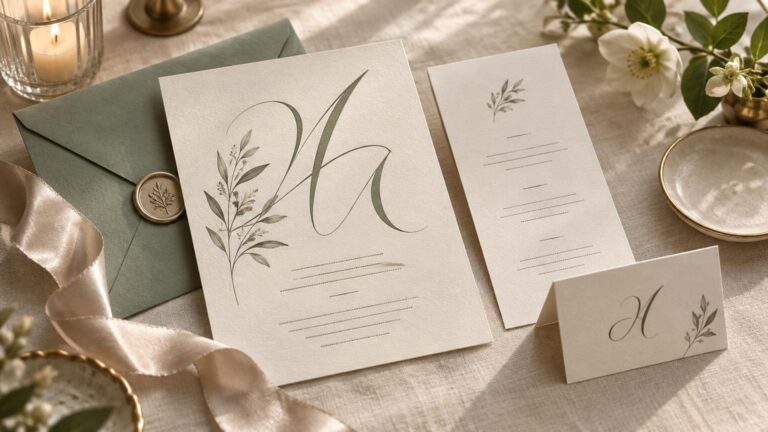
Possible applications include save-the-dates, invitation cards, envelope liners, belly bands, RSVP cards, seals and thank-you notes. The mark should support the information hierarchy rather than compete with names, dates and response instructions. Use the invitation suite checklist to separate necessary pieces from optional decorative upgrades.
If the identity will anchor the paper suite, select paper and finishing with the mark’s construction in mind. A printer should confirm whether fine lines, small counters, reversals and layered colors suit the chosen process. Paper grammage describes weight in grams per square meter, but weight alone does not tell you how a stock will fold, emboss or move through a particular press. A physical proof or representative sample is more informative than choosing by a paper number alone.
When you are ready to translate the identity into cards and coordinated stationery, compare specifications and production options for custom-printed invitations rather than assuming one artwork file will suit every process.
Signs, seating and wayfinding
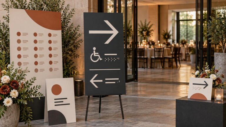
A welcome sign, seating chart, bar menu and directional sign perform different jobs. Repeat the mark to establish continuity, but give operational information more visual weight. Guests should not have to decode a crest to locate registration, dinner, restrooms or transportation.
The 2010 ADA Standards contain an exception from cited signage requirements for temporary signs used for seven days or less, while permanent identification signs can be subject to more specific requirements. Applicability depends on the venue and installation, so confirm project requirements rather than treating temporary status as a general exemption. Regardless of the legal category, readable type, clear labels, strong contrast and unambiguous arrows improve the guest experience. The accessible event design guide covers practical typography and wayfinding considerations, while the official 2010 ADA Standards for Accessible Design provide the underlying federal standards.
Favors and small details
Favor tags, bottle labels, stickers, napkins and seals expose weak details quickly. Test the mark at final size without enlarging it on screen. If interior lines close up or the event name becomes illegible, use a compact submark rather than forcing the primary crest into the space.
Projection, websites and social assets
Projected graphics need simple silhouettes and sufficient contrast against the actual surface and ambient lighting. Digital applications may include an RSVP page, event website, email header, social template, presentation slide and post-event gallery. Supply a horizontal version for headers and a compact version for avatars instead of repeatedly cropping the primary artwork.
When a digital graphic communicates the event name, date or another meaningful function, its text alternative should convey that information or function. Purely decorative artwork can be treated as decorative, according to the W3C’s guidance on accessible images. Do not place essential event details only inside an image.
Commission a system, not one fragile file
A usable identity package should anticipate different backgrounds, orientations and production methods. Ask the designer to define what is included before comparing proposals, because revision limits, usage rights and deliverables can vary substantially.
For a multi-application event, useful deliverables commonly include:
- A primary lockup containing the complete identity.
- A compact monogram, icon or simplified submark.
- Horizontal and stacked arrangements when the name permits them.
- Full-color, one-color and reversed versions for light and dark backgrounds.
- Vector artwork for scalable production, in formats accepted by the selected vendors.
- Raster exports sized for websites, email, social platforms and presentations.
- A short usage sheet covering colors, typefaces, spacing and minimum practical reproduction sizes.
- Any font files or licensing instructions the client will need, where the license permits transfer.
Do not accept a transparent PNG as the only master asset for an identity intended for signs, foil, cutting or projection. It may be useful for digital placement, but production vendors often need scalable artwork and clearly defined colors. Confirm the required file type with each vendor before final delivery.
Proof the identity under real production conditions
A screen review cannot reveal every failure. Proof the mark at the smallest printed size, on the intended background and through any special finishing process. For large signage, inspect a full-size section from the expected viewing distance. For projection, test the actual projector, surface and lighting if access is available.
QR codes require their own proofing pass. DENSO WAVE notes that insufficient printing resolution and poor contrast can prevent reading in particular configurations. Generate the code for the final destination, place it at its actual output size, print a final-format proof and scan it with multiple available devices under realistic lighting. Also print a short URL nearby so the code is not the guest’s only route. Add names, URLs, codes and dependent files to an event proofing checklist before release.
Mailing format also deserves an early test. USPS lists letter-size boundaries of 3.5 to 6.125 inches high, 5 to 11.5 inches long and 0.007 to 0.25 inches thick. USPS also identifies square envelopes as an example of nonmachinable mail. If a suite is square, thick, rigid or embellished, take a fully assembled sample to the relevant postal service and confirm current treatment and postage before ordering the complete quantity.
When to skip the custom mark
A dedicated event logo is probably unnecessary when the invitation is its only confirmed use, the production calendar is already tight, core details are still changing or the design depends on detail that will not survive the smallest application. It is also reasonable to skip one when guests need clarity more than another decorative layer.
In those situations, build the visual system from a distinctive heading typeface, a readable supporting typeface, a controlled color palette and one repeatable rule, border or motif. Apply those elements consistently across invitations, menus, signs and digital materials. This can look intentional without creating a separate asset that must be adapted, approved and managed.
Make the decision from the application list
Start by listing every confirmed use and marking its smallest size, largest size, production method and deadline. If one adaptable mark will solve several of those design problems, commissioning a custom identity is defensible. Request a primary lockup, simplified submark, one-color version and appropriate production files from the beginning.
If the list contains only one or two decorative placements, put the budget toward excellent typography, paper, printing or clearer signage instead. Cohesion comes from disciplined repetition, not from placing a logo on every surface. The right identity is the simplest system that remains recognizable, readable and useful throughout the event.